柱状图
利用Mathematica绘制基本的柱状图的命令大致如下:
1
2
3
4
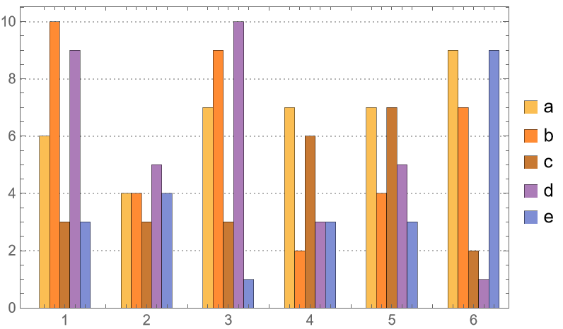
| data = RandomInteger[{1, 10}, {6, 5}];
BarChart[data,
ChartLabels -> {{"1", "2", "3", "4", "5", "6"}, None},
ChartLegends -> {"a", "b", "c", "d", "e"}]
|
此时将会输出如下的图片

同时可以选择下面几种布局方式:
1
2
3
| BarChart[data, ChartLayout -> "Stacked",
ChartLabels -> {{"1", "2", "3", "4", "5", "6"}, None},
ChartLegends -> {"a", "b", "c", "d", "e"}]
|
1
2
3
| BarChart[data, ChartLayout -> "Percentile",
ChartLabels -> {{"1", "2", "3", "4", "5", "6"}, None},
ChartLegends -> {"a", "b", "c", "d", "e"}]
|
1
2
3
| BarChart[data, ChartLabels -> {{"1", "2", "3", "4", "5", "6"}, None},
ChartLegends -> {"a", "b", "c", "d", "e"},
BarOrigin -> Left]
|
1
2
3
4
| BarChart[data, ChartLabels -> {{"1", "2", "3", "4", "5", "6"}, None},
ChartLegends -> {"a", "b", "c", "d", "e"},
ChartLayout -> "Stepped",
BarSpacing -> {0, 0}]
|
通过调整BarSpacing可以改变条形图的间隔
1
2
3
| BarChart[data, ChartLabels -> {{"1", "2", "3", "4", "5", "6"}, None},
ChartLegends -> {"a", "b", "c", "d", "e"},
BarSpacing -> {0, 3}]
|
同时BarChart也支持绘图主题的选择,比如下面的Detailed主题。
1
2
3
4
| BarChart[data, ChartLabels -> {{"1", "2", "3", "4", "5", "6"}, None},
ChartLegends -> {"a", "b", "c", "d", "e"},
PlotTheme -> "Detailed",
BarSpacing -> {0, 3}]
|
函数图
利用Mathematica绘制基本的函数的命令大致如下:
1
2
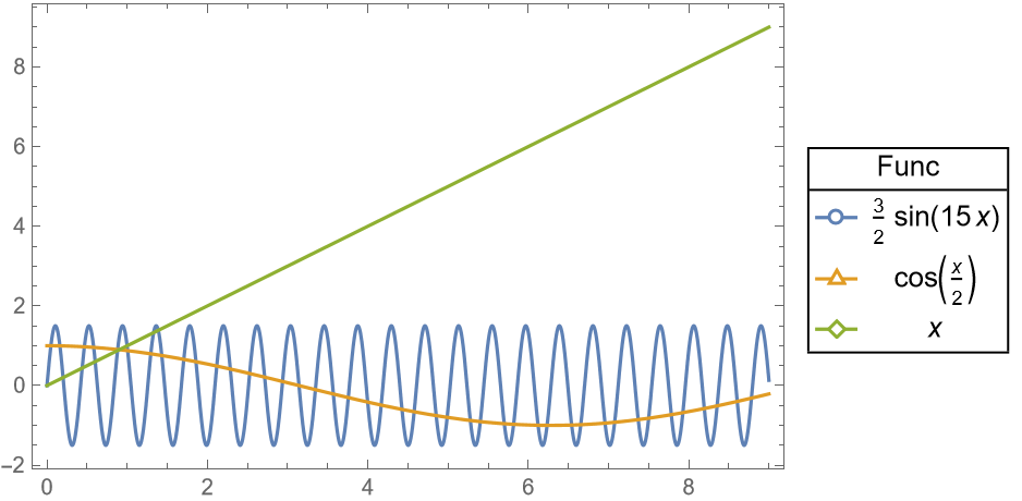
| funcs = {3/2 Sin[15 x], Cos[x/2], x};
Plot[funcs, {x, 0, 9}]
|
此时将会输出如下的图片
同时,可以利用ListPlot绘制点集图
1
2
3
| ListPlot[Table[funcs, {x, 0, 9, 1}] // Transpose,
PlotMarkers -> "OpenMarkers",
DataRange -> {0, 9}]
|
此时注意设置选项DataRange,来表示点集应该占据坐标轴的什么位置。
为了美观,可以设置边框以及图例
1
2
3
4
5
6
7
8
| Plot[funcs, {x, 0, 9},
Frame -> True,
Axes -> False,
PlotLegends -> LineLegend[
funcs,
LegendLayout -> (Grid[Join[{{"Func", SpanFromLeft}}, #],
Dividers -> {{True, False, True}, {True, True, False, False, True}}] &),
LegendMarkers -> "OpenMarkers"]]
|
Frame->True:添加边框Axes->False:删除坐标轴PlotLegends->...:添加图例
然后利用Show,将两图合并
1
2
3
4
5
6
7
8
9
| Show[Plot[funcs, {x, 0, 9},
Frame -> True, Axes -> False,
PlotLegends -> LineLegend[
funcs,
LegendLayout -> (Grid[Join[{{"Func", SpanFromLeft}}, #],
Dividers -> {{True, False, True}, {True, True, False, False, True}}] &),
LegendMarkers -> "OpenMarkers"]],
ListPlot[Table[funcs, {x, 0, 9, 1}] // Transpose,
PlotMarkers -> "OpenMarkers", DataRange -> {0, 9}]]
|
当然也能够选择其他绘图主题:
1
2
3
4
5
6
7
8
9
| Show[Plot[funcs, {x, 0, 9},
PlotLegends -> LineLegend[
funcs,
LegendLayout -> (Grid[Join[{{"Func", SpanFromLeft}}, #],
Dividers -> {{True, False, True}, {True, True, False, False, True}}] &),
LegendMarkers -> "OpenMarkers"], PlotTheme -> "Detailed"],
ListPlot[Table[funcs, {x, 0, 9, 1}] // Transpose,
PlotMarkers -> "OpenMarkers", DataRange -> {0, 9},
PlotTheme -> "Detailed"]]
|
1
2
3
4
5
6
7
8
9
| Show[Plot[funcs, {x, 0, 9},
PlotLegends -> LineLegend[
funcs,
LegendLayout -> (Grid[Join[{{"Func", SpanFromLeft}}, #],
Dividers -> {{True, False, True}, {True, True, False, False, True}}] &),
LegendMarkers -> "OpenMarkers"], PlotTheme -> "Scientific"],
ListPlot[Table[funcs, {x, 0, 9, 1}] // Transpose,
PlotMarkers -> "OpenMarkers", DataRange -> {0, 9},
PlotTheme -> "Scientific"]]
|
密度图
利用Mathematica绘制基本的密度图的命令大致如下:
1
2
3
4
| pdfs = {PDF[NormalDistribution[-4, 2], x],
PDF[NormalDistribution[4, 6], x],
1/2 PDF[NormalDistribution[-3, 1], x] + 1/2 PDF[NormalDistribution[5, 1.5], x]};
Plot[pdfs, {x, -8, 12}]
|
此时将会输出如下的图片
同时为了美观,也可以显示面积,添加图例和边框,指定绘制范围等
1
2
3
4
5
| Plot[pdfs, {x, -8, 12}, Filling -> Axis,
PlotLegends -> {"\!\(\*SubscriptBox[\(f\), \(1\)]\)",
"\!\(\*SubscriptBox[\(f\), \(2\)]\)",
"\!\(\*SubscriptBox[\(f\), \(3\)]\)"}, Frame -> True,
Axes -> False, PlotRange -> {{-8, 12}, {0, 0.25}}]
|
当然也能够选择其他绘图主题:
1
2
3
4
5
| Plot[pdfs, {x, -8, 12}, Filling -> Axis,
PlotLegends -> {"\!\(\*SubscriptBox[\(f\), \(1\)]\)",
"\!\(\*SubscriptBox[\(f\), \(2\)]\)",
"\!\(\*SubscriptBox[\(f\), \(3\)]\)"},
PlotRange -> {{-8, 12}, {0, 0.25}}, PlotTheme -> "Detailed"]
|
1
2
3
4
5
| Plot[pdfs, {x, -8, 12}, Filling -> Axis,
PlotLegends -> {"\!\(\*SubscriptBox[\(f\), \(1\)]\)",
"\!\(\*SubscriptBox[\(f\), \(2\)]\)",
"\!\(\*SubscriptBox[\(f\), \(3\)]\)"},
PlotRange -> {{-8, 12}, {0, 0.25}}, PlotTheme -> "Scientific"]
|